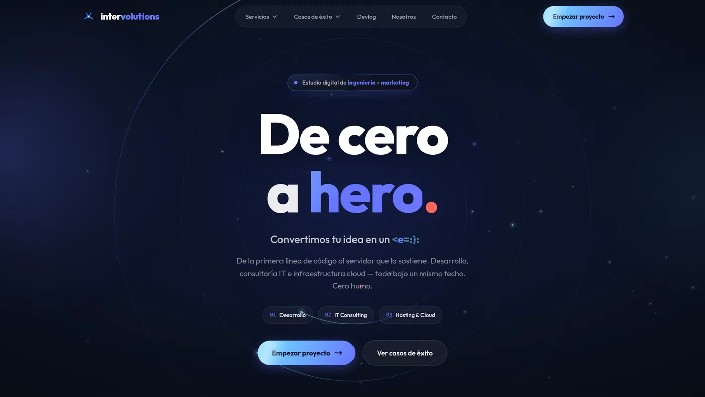
Our own site had the classic cobbler's-children problem: it worked, but it didn't tell anyone who we are. We rebuilt it from scratch. This is the diary of how we put together the hero (the hardest part, and the most memorable) without dying on the performance front.
The starting point
We were coming from a background with green gradients and some connected constellation-style particles. It was fine, but generic: you've seen it in a thousand templates. We wanted something that said engineering + creativity at first glance: depth, slow and sophisticated motion, and an editorial, almost movie-trailer edge.
We set three rules before touching a line of code: dark and clean (midnight navy, not flat black), cobalt and cyan as the brand colors, and ambient motion that lifts the headline instead of competing with it.
Five layers, each with its own tool
The key to a background like this is not cramming everything into one place. We split it into layers and gave each one the tech that performs best: base gradient and vignette in pure CSS (zero cost), ambient glows as radial-gradient, and, most important, the orbital rings and particles in a single <canvas>.
Reserve the Canvas for the one thing that truly benefits (dozens of moving dots and arcs) and leave the rest in static CSS. A DOM full of blur-animated divs would have been unmanageable.
Text that decodes itself
The tagline is «From zero to hero.». We added a scramble effect: on load, «hero» and the whole subtitle decode from random characters to the final text, like a terminal. The important detail is that we made it framerate-independent: each character has its own window in milliseconds, so the decode always takes ~0.9s even on a slow machine.
// cada carácter resuelve por tiempo, no por frames
const start = Math.random() * 420;               // ms
const end = start + 160 + Math.random() * 460;   // termina ~580–1040 ms
queue.push({ from: old[i] || '', to: newText[i] || '', start, end });
The war for 60 fps
This is where the project got interesting. The first version ran at 5 fps. Five. We measured layer by layer and found the culprits: mix-blend-mode and filter: blur() on large elements. Every frame, the compositor had to redo the blur of the entire screen because something (the canvas) was changing underneath.
The fixes: switch the glows from filter: blur to radial-gradient (one paint, not a filter that re-rasterizes), remove all the mix-blend-mode, and move the rings from CSS (which rotated a conic mask and produced a subtle jitter) to Canvas, where they redraw cleanly on every frame.
90% of the performance of an animated background isn't in your algorithm: it's in not forcing the compositor to redo expensive layers every frame.
Mental note, commit at 2 a.m.
The result
A hero that shows from the very first pixel (the background slides under the transparent header, seamlessly), with a light that turns slowly around the headline, drifting particles, and the text decoding. And it respects prefers-reduced-motion: if you've asked for less motion, it freezes on a perfectly legible static frame.
Performance and beauty aren't at odds, but they do fight. The version that's both pretty AND fast came from measuring instead of assuming: profiling each layer saved us hours of blind tweaking.