Agency sites say "we're technical" with a paragraph and a stock photo. We'd rather prove it: we dropped a real console in the middle of the homepage and an estimator that reacts to every click. This post covers how both pieces were built and what we learned from watching people play with them.
A real terminal, not a mockup
The "Under the hood" section is a command interpreter written in vanilla JS: history with ↑↓, Tab autocomplete (with ghost text), quick-access chips and a boot sequence with a wink built in: sales fluff… [not found]. The commands respond with real content: services, case studies with links, stack, contact.
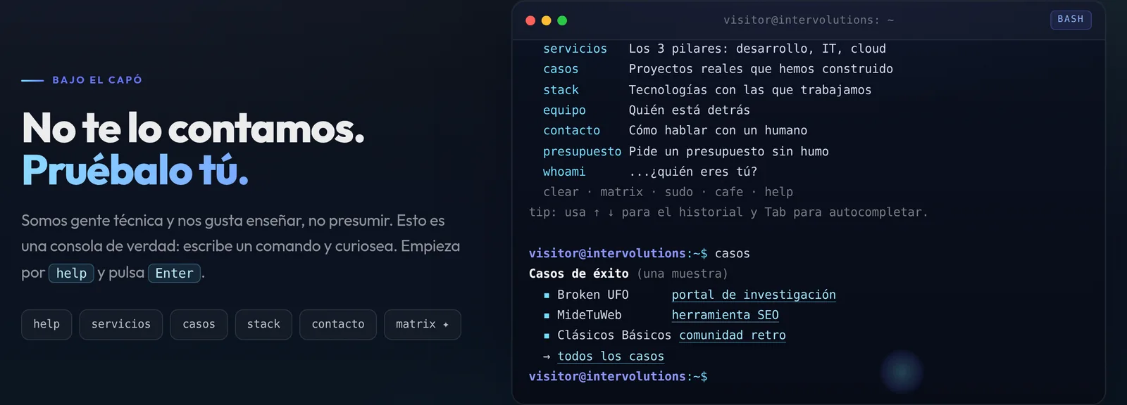
The detail people love most is the easter egg: type matrix and a digital rain in cobalt/cyan (with INTERVOLUTIONS glyphs slipped in) takes over the screen for a few seconds. Canvas 2D, zero libraries, and paused the moment you leave the viewport.
Astro scopes styles per component, but the lines the JS creates at runtime don't carry that scope. Solution: global styles with a .term-* prefix. Twenty minutes of debugging that we're giving you here for free.
The estimator: marketing you can play
The classic CTA ("shall we talk?") asked for faith. The new one asks for 30 seconds of play: you pick what you're building, add powers to it and a live panel builds your plan: phases that light up, weeks and a price range with numeric interpolation, and an ambition meter that runs from Lean MVP to Flagship.
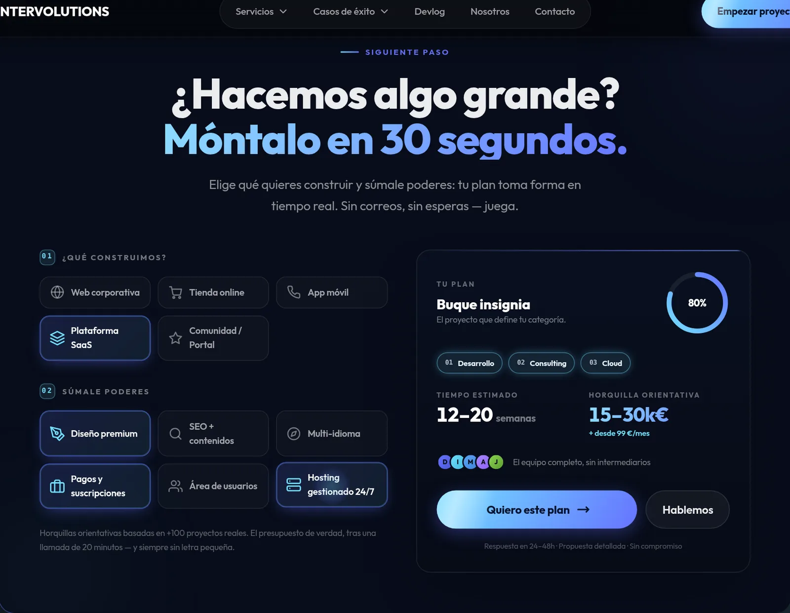
The trick is in closing the loop: "Send me this plan" arrives at the quote form with the plan already written into the message. The visitor lands on the form with the plan already written and the conversation already started. Less friction for them, a much better brief for us.
- Numbers with tween and pop: changes are felt, not read
- Particle sparks on every click (5 DOM nodes, 600ms lifespan)
- SVG gauge with stroke-dashoffset: cheap and smooth
- Everything respects prefers-reduced-motion
The best proof that we know how to build interactive products is that our own site is one.
Internal project note
A console has to work from the keyboard or it is not a console
The risk with a piece like this is building it for the demo rather than for use. The prompt is a real input, with a visible focus ring, and it behaves the way anyone who has used a terminal expects: arrows for history, Tab to complete, Escape to clear. No capturing keystrokes on document and guessing.
Output is announced in a live region, so a screen reader reads the response to a command instead of leaving the user unsure whether anything happened. And everything the console can tell you — services, cases, contact — is also on the page as ordinary content: the terminal is another way to reach the same things, never the only way.
What it costs in bytes, and when you pay it
Two interactive pieces are JavaScript somebody has to download. The discipline is in the when. The interpreter is not part of the initial bundle: the front page paints first and the console module loads afterwards, or when the section approaches the viewport. If nobody scrolls that far, nobody pays for it.
The estimator is the other way round, because it sits higher and it is the piece that converts — but it still does not block paint. Both are hand-written JavaScript with no libraries: that is not a badge, it is that a thirty-kilobyte dependency to animate a number is exactly the kind of decision that makes a site slow without anyone knowing why.
The motion switches off completely when it should
The matrix rain, the click sparks, the number tweening and the gauge: all of it disappears under prefers-reduced-motion. Not slowed down — removed. And the information stays: the final number simply appears in place, the gauge draws at its position, the console answers without a typing animation.
The rain also pauses when the section leaves the screen and when the tab stops being visible. An animated canvas running in the background is battery draining with nobody watching.
Open the page with the machine throttled to a quarter of its speed. If the interaction still responds under that, it will respond on a mid-range phone.
When NOT to build something like this
This works on the site of a company that sells development, because the piece is the argument: it demonstrates the capability the copy is claiming. On the site of an accountant, a clinic or a small-town shop it would be expensive noise, and we would say so just as plainly.
The question before building anything interactive is always the same: does this move the visitor closer to the action that matters, or does it just give them something more entertaining to do than becoming a customer? If it is the second, we do not build it.